Atharv Patole
Data analyst in the making, turning complex chaos into clear insight with curiosity, code, and a storyteller’s lens
About
I’m not just crunching numbers—I’m decoding the why behind them. As a Computer Science student at Pace University, I blend statistical thinking with creative storytelling to surface insights that matter. My background spans full-time and teaching roles where I’ve cleaned messy data, built predictive models, and designed dashboards that simplify decision-making. I work fluently in SQL, Python, Power BI, and Excel, but what drives me is the aha! moment—when a pattern clicks, a trend reveals itself, or a stakeholder finally sees the story behind the spreadsheet. I don’t just analyze; I connect the dots, ask better questions, and build solutions that stick. If your team values curiosity, clarity, and impact, I’m ready to dive in.
Skills

Excel | Power BI | Tableau | SQL | Python
Excel: 4+ years turning spreadsheets into strategy
Tableau: 2 years visualizing stories that matter
Power BI: 2 years designing dynamic, interactive reports
Python: 3 years wrangling, analyzing, and automating data
Communication: 5+ years translating data into decisions
Problem-Solving: 4+ years uncovering insights that drive action
Work
Data Analyst, Full-Time
Scon Infrastructure |Mumbai, India
July 2021 - June 2023
Analyzed project data to support planning and reporting. Built dashboards, automated reports, and identified key trends to improve efficiency. Collaborated with cross-functional teams to deliver clear, actionable insights.
Projects
Uber Ride Analysis

Processed and analyzed ride data to uncover peak-hour surges and high-demand pickup zones. Visualized key patterns using plotting libraries, revealing insights on trip length, frequency, and distance. Delivered recommendations to optimize driver allocation and reduce wait times, improving overall efficiency.
Covid-19 Visualization
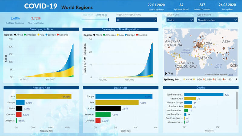
Used BI tools to analyze global pandemic data, tracking cases, recoveries, deaths, and vaccination rates across 100+ countries. Built interactive visuals to show trends and shared insights through a central report.
Game Data Analysis

Explored UEFA Champions League data using Python and built a Power BI dashboard with insights on goals, assists, and player stats. Used PostgreSQL to manage and connect the data for visual analysis.
Contact
I’m always open to discussing data, collaboration opportunities, or exciting projects.
Feel free to reach out. I’d love to connect!